Color Harmony
Artists use color harmony to create aesthetically pleasing masterpieces. It is when colors work well together. How do you achieve this? We do so by using color combinations.
COLOR COMBINATIONS

Color combinations are tried and tested selections of colors that help us achieve cohesive and interesting paintings. Artists don't just pick out random colors, they know that color selection greatly affects the mood or impression of a painting. So, they use specific color combinations, and so should you.
But there are various color combinations! How do you pick out which one to use? Before you start anything, consider the message you want to express through your art work. Do you want an artwork radiating happiness? Do you want to paint a serene landscape? Perhaps a moody portrait?
Once you've decided, see which combination(s) fit your choice of mood.

ACHROMATIC

This color combination technically does not use colors at all. It involves the use of only black, white, and different grays. To use this color combination in painting, we only use certain kinds of black like Ivory Black and Lamp Black or we mix our own neutrals. In addition to that, we use water or white to mix lighter shades. This color combination creates monotonous paintings - giving off a hint of drama or seriousness in an artwork. This lets artists utilise other elements (such as composition or contrast) in a painting to be the center of attention.
MONOCHROMATIC

A painting that is monochromatic in color harmony uses only one hue or color and its lighter or darker variations. This means one color is used with different amounts of black and white. The sample scale and apple painting above use tones and tints of red. With this color combination, a painting will have little contrast but is sure to have a very unified look.
ANALOGOUS
Colors used: Lemon Yellow, French Vermilion, Red Sennelier, and Ivory Black
This color harmony uses three to five colors which are all adjacent of each other in the color wheel. It is one of the easiest to use in paintings as it is pleasing to the eyes. Compared to the Achromatic and Monochromatic color schemes, it is a step up with regards to visual contrast.
COMPLEMENTARY

Colors used: Forest Green and Sennelier Red
Two colors that are opposite of each other in the color wheel are called "complementary" colors. This combination produces the highest contrast possible. When mixed together in the paletter, it produces gray or a neutral color. Many of pop artworks use this color scheme due to its boldness. It can be tricky to use, you must be careful with the amount of color saturation in painting to avoid over-contrast. It's good to study carefully which color will be used as the main color of your subject matter and background. In the painting above, red is used as the main attraction of the painting whereas green is used as a supporting color and background.
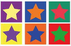
Here we see how other complementary combinations. Look at how each color interacts with the other as the "star" of a work. The colors in the illustration are all in full saturation. You may make colors lighter or darker to balance and harmonize them.
SPLIT-COMPLEMENTARY

Colors used: Phtalo Green Light, Sennelier Red, Forest Green and Phtalo Blue (for Blue Green)
The split-complementary color scheme is like the complementary color scheme, but thi combination is usually used with a primary color (for this example it is red) and two tertiary colors (blue green and yellow green). This combination lets you explore more colors at once. As you add more colors (along with their different shades) in a painting, there is more challenge to create a cohesive work. Remember that you can mix colors together to create gray or neutral colors for shadows.
TRIAD

Colors used: Lemon Yellow, Sennelier Red, Phtalo Blue
This color combination uses three colors that form a perfect triangle in the color scheme. This combination gives a more intense effect. It's a good choice if you want to create interesting and striking paintings. Try the different triads possible in the color wheel to achieve different visually intense harmonies. Don't be afraid to use and mix vibrant colors together.
Where you use the Colours
Warm Colosdrs #
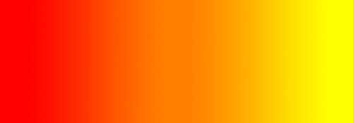
Warm colors include red, orange, and yellow, and variations of those three colors. These are the colors of fire, of fall leaves, and of sunsets and sunrises, and are generally energizing, passionate, and positive.
Red and yellow are both primary colors, with orange falling in the middle (making it a secondary color), which means warm colors are all truly warm and aren’t created by combining a warm color with a cool color. Use warm colors in your designs to reflect passion, happiness, enthusiasm, and energy.
Red (Primary Color) #

Red is a very hot color. It’s associated with fire, violence, and warfare. It’s also associated with love and passion. In history, it’s been associated with both the Devil and Cupid. Red can actually have a physical effect on people, raising blood pressure and respiration rates. It’s been shown to enhance human metabolism, too.
Red can be associated with anger, but is also associated with importance (think of the red carpet at awards shows and celebrity events). Red also indicates danger (the reason stop lights and signs are red, and that warning labels are often red).
Outside the western world, red has different associations. For example, in China, red is the color of prosperity and happiness. It can also be used to attract good luck. In other eastern cultures, red is worn by brides on their wedding days. In South Africa, however, red is the color of mourning. Red is also associated with communism.
Red has become the color associated with AIDS awareness in Africa due to the popularity of the [RED] campaign.
In design, red can be a powerful accent color. It can have an overwhelming effect if it’s used too much in designs, especially in its purest form. It’s a great color to use when power or passion want to be portrayed in the design. Red can be very versatile, though, with brighter versions being more energetic and darker shades being more powerful and elegant.
Examples #
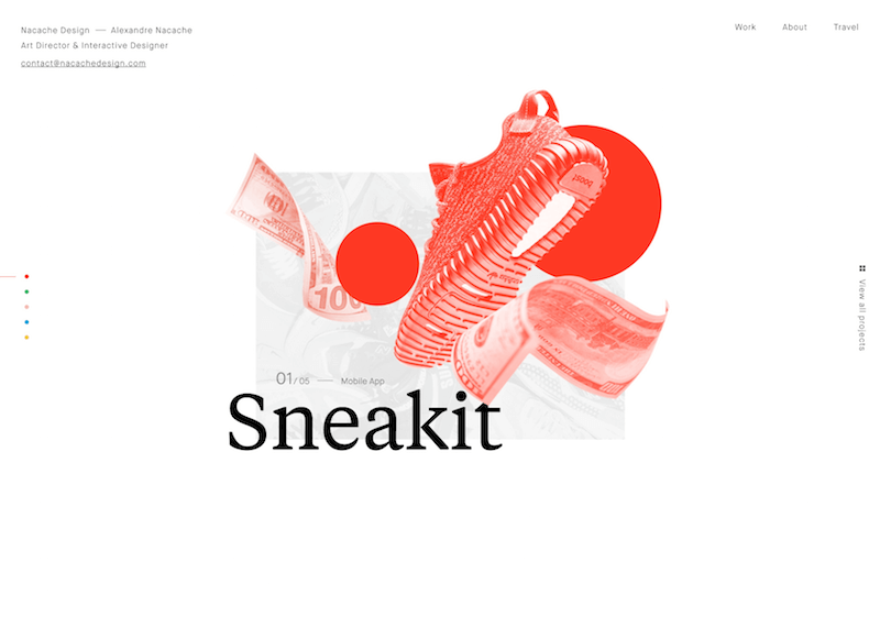
The bright red of the illustration on the homepage of Nacache Design’s site gives the page a ton of energy and vibrancy.
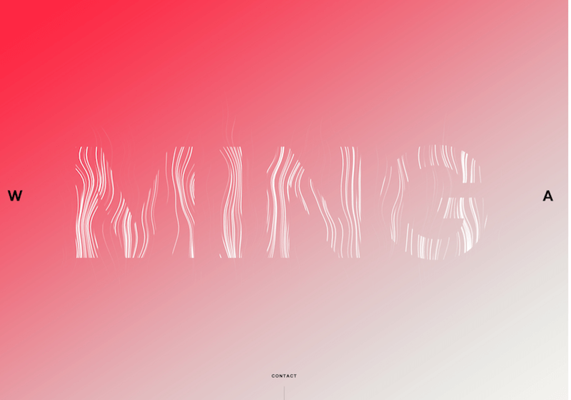
The bright pinkish red of the background on Ming Lab’s website is inviting and passionate. (2010)
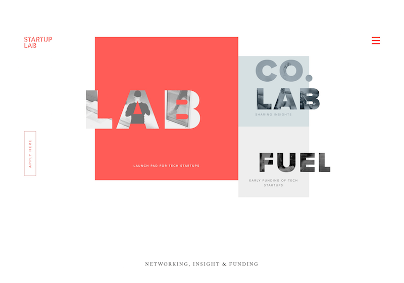
The muted red on the Startup Lab website is energetic without being aggressive. (2010)
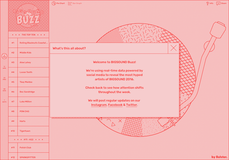
Bigsound Buzz’s website uses a monochromatic design of various shades and tones of red, which in this instance gives a poppy, retro vibe. (2010)
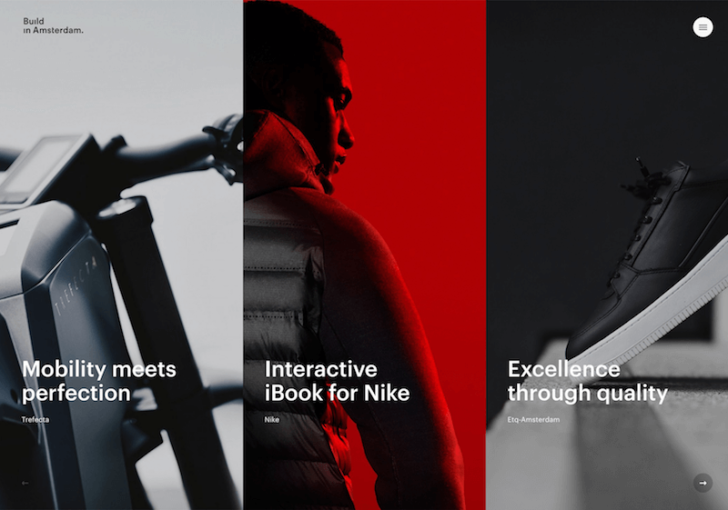
Build in Amsterdam’s website uses a vibrant red accent color that draws attention to the middle of the page immediately. (2010)
Orange (Secondary Color) #

Orange is a very vibrant and energetic color. In its muted forms it can be associated with the earth and with autumn. Because of its association with the changing seasons, orange can represent change and movement in general. Orange is also strongly associated with creativity.
Because orange is associated with the fruit of the same name, it can be associated with health and vitality. In designs, orange commands attention without being as overpowering as red. It’s often considered more friendly and inviting, and less in–your–face.
Examples #
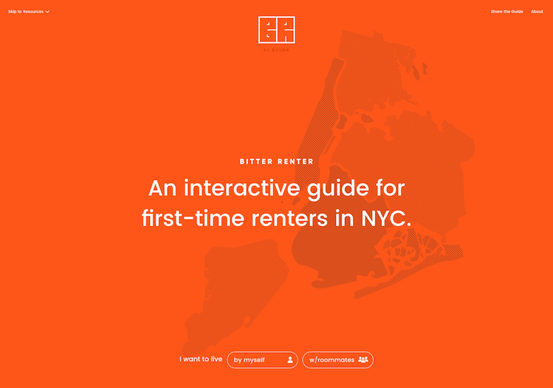
Bitter Renter’s bright and bold home page takes full advantage of the energy that orange can provide to a design.
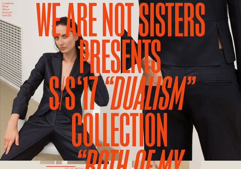
We Are Not Sisters’ dark orange, oversized typography makes an immediate impact. (2010)
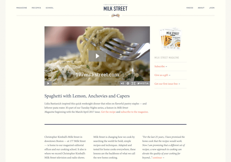
Christopher Kimball’s Milk Street’s subtle use of orange as an accent color shows it can be used in more elegant and conservative designs. (2010)
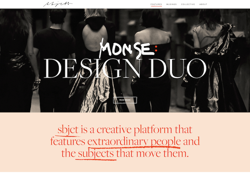
Sbjct mixes a subtle peach color with a dark orange for a more monochromatic design that still has a lot of energy. (2010)
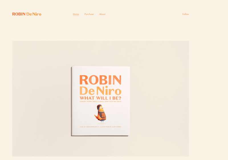
Robin De Niro also uses a very light peach background with two shades of orange for the typography, in a much more understated design.
Yellow (Primary Color) #

Yellow is often considered the brightest and most energizing of the warm colors. It’s associated with happiness and sunshine. Yellow can also be associated with deceit and cowardice, though (calling someone yellow is calling them a coward).
Yellow is also associated with hope, as can be seen in some countries when yellow ribbons are displayed by families who have loved ones at war. Yellow is also associated with danger, though not as strongly as red.
In some countries, yellow has very different connotations. In Egypt, for example, yellow is for mourning. In Japan, it represents courage and in India it’s a color for merchants.
In your designs, bright yellow can lend a sense of happiness and cheerfulness. Softer yellows are commonly used as a gender–neutral color for babies (rather than blue or pink) and young children. Light yellows also give a more calm feeling of happiness than bright yellows. Dark yellows and gold–hued yellows can sometimes look antique and be used in designs where a sense of permanence is desired.
Examples #
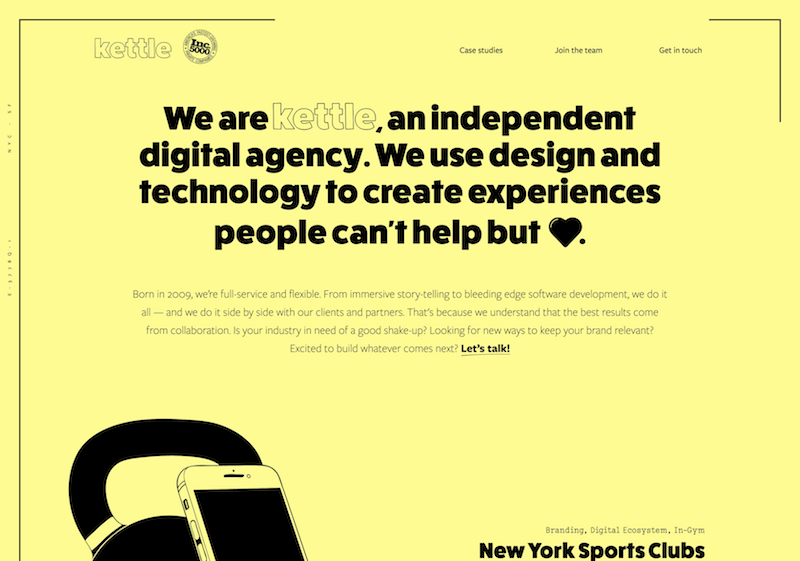
Kettle’s not-quite-true-yellow is lively and vibrant without being overwhelming. (2010)
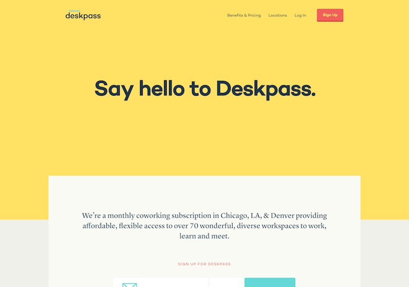
Deskpass uses a slightly darker yellow, giving it an eye–catching but slightly muted look. (2010)
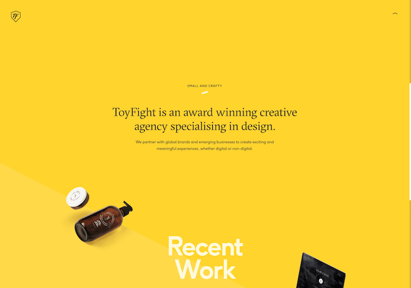
Toyfight uses a bright goldenrod background, but otherwise keeps their design simple and straightforward.
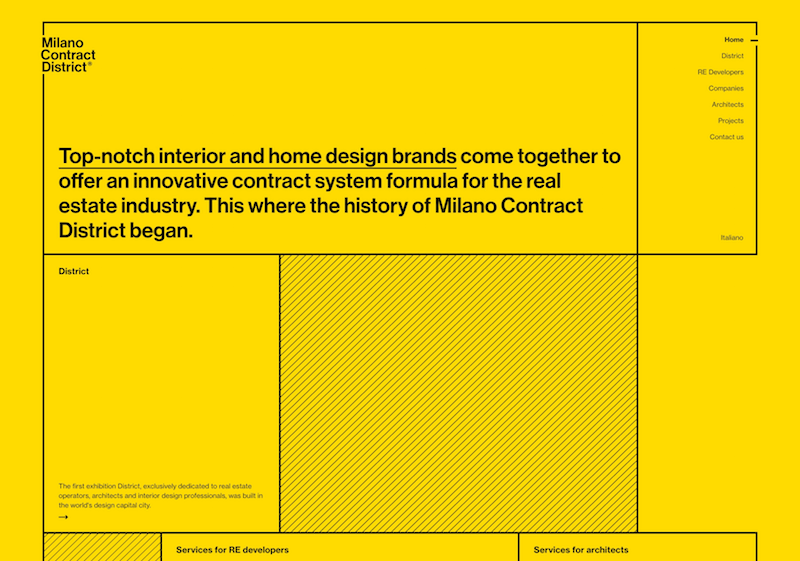
Milano Contract District’s website is simple and minimalist, with all of the impact of the design coming from the bright yellow background.
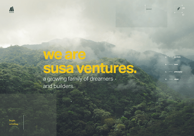
Susa Ventures uses a goldenrod hue as an accent color in their typography to great effect.
Cool Colors #
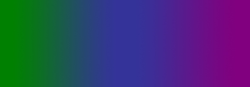
Cool colors include green, blue, and purple, are often more subdued than warm colors. They are the colors of night, of water, of nature, and are usually calming, relaxing, and somewhat reserved.
Blue is the only primary color within the cool spectrum, which means the other colors are created by combining blue with a warm color (yellow for green and red for purple).
Because of this, green takes on some of the attributes of yellow, and purple takes on some of the attributes of red. Use cool colors in your designs to give a sense of calm or professionalism.
Green (Secondary Color) #

Green is a very down–to–earth color. It can represent new beginnings and growth. It also signifies renewal and abundance. Alternatively, green can also represent envy or jealousy, and a lack of experience.
Green has many of the same calming attributes that blue has, but it also incorporates some of the energy of yellow. In design, green can have a balancing and harmonizing effect, and is very stable.
It’s appropriate for designs related to wealth, stability, renewal, and nature. Brighter greens are more energizing and vibrant, while olive greens are more representative of the natural world. Dark greens are the most stable and representative of affluence.
Examples #
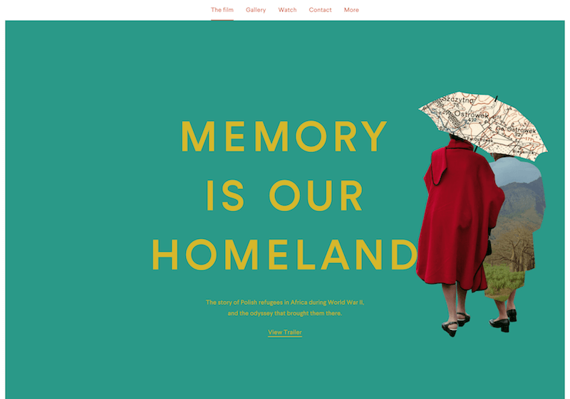
The site for Memory is Our Homeland uses a blue–green hue that’s energized by the yellow typography without being too bright.
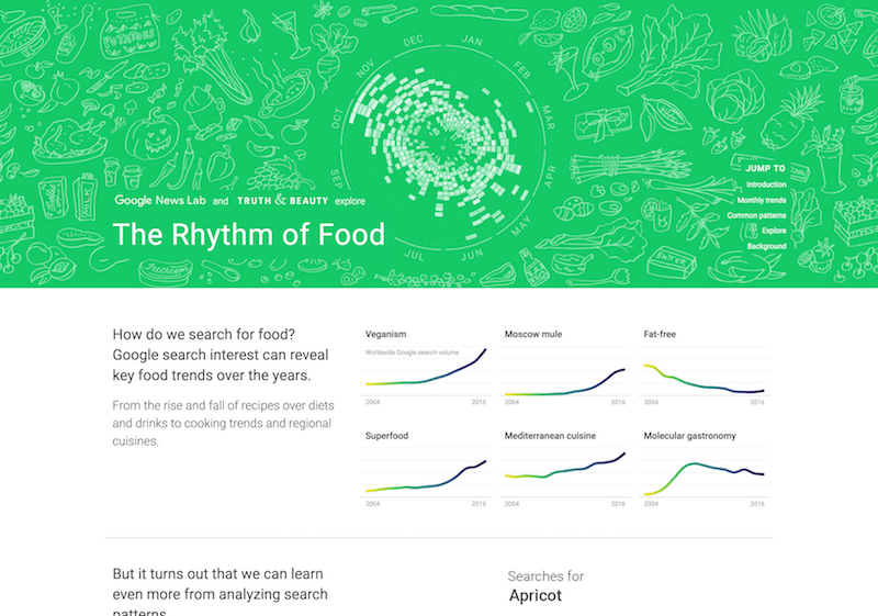
The Rhythm of Food’s site uses a bright kelly green that’s ideal for a site that ties together food and information.
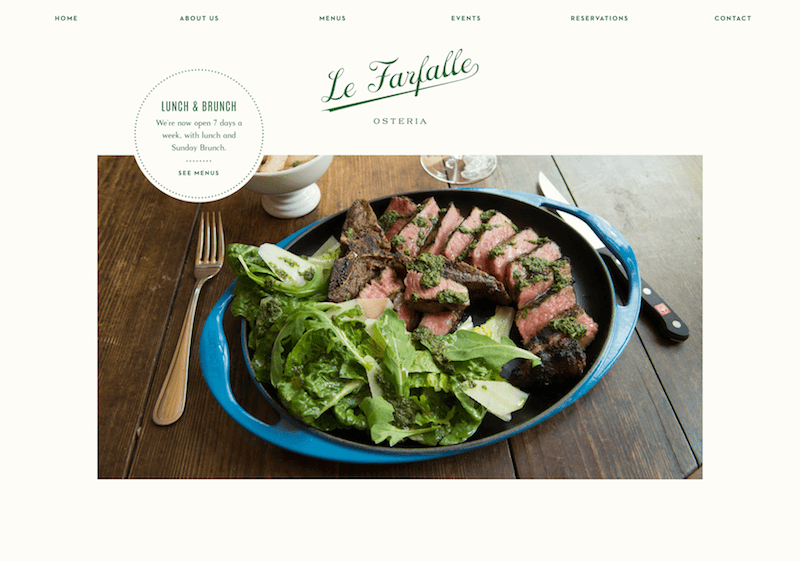
Rich, hunter green makes a great accent color on an elegant restaurant website like Le Farfalle Osteria’s. (2010)
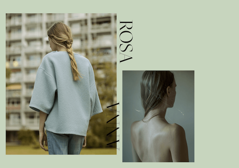
Anna Rosa Krau’s website has a soft sage green background, which works almost as a neutral for this portfolio.
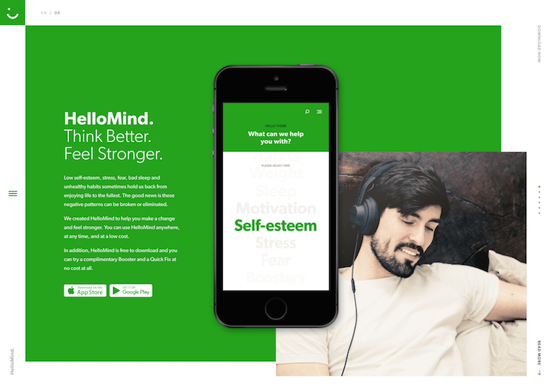
HelloMind’s bright green background is youthful and gives a sense of growth (in line with their product for improving your brain function).

Studio Farquhar’s lime green accents are punchy and modern, and stand out in their minimalist layout.
Blue (Primary Color) #

Blue is often associated with sadness in the English language. Blue is also used extensively to represent calmness and responsibility. Light blues can be refreshing and friendly. Dark blues are more strong and reliable. Blue is also associated with peace and has spiritual and religious connotations in many cultures and traditions (for example, the Virgin Mary is generally depicted wearing blue robes).
The meaning of blue is widely affected depending on the exact shade and hue. In design, the exact shade of blue you select will have a huge impact on how your designs are perceived. Light blues are often relaxed and calming. Bright blues can be energizing and refreshing. Dark blues, like navy, are excellent for corporate sites or designs where strength and reliability are important.
Examples #

The bright blue background of the Future of Design Survey results website homepage stands out, and is then used as an accent color throughout the rest of the site. (2010)

Versett uses a bright blue as the primary color on their website, along with a number of other bright hues to differentiate different sections. (2010)
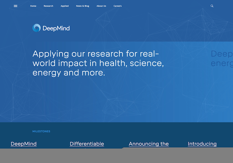
Deep Mind’s website uses various shades of blue for its background, giving it a trustworthy, authoritative feel. (2010)
Purple (Secondary Color) #

In ancient times, the dyes used for creating purple hues were extracted from snails and were very expensive, so only royals and the very wealthy could afford them.
Purple is a combination of red and blue and takes on some attributes of both. It’s associated with creativity and imagination, too.
In Thailand, purple is the color of mourning for widows. Dark purples are traditionally associated with wealth and royalty, while lighter purples (like lavender) are considered more romantic.
In design, dark purples can give a sense wealth and luxury. Light purples are softer and are associated with spring and romance.
Examples #
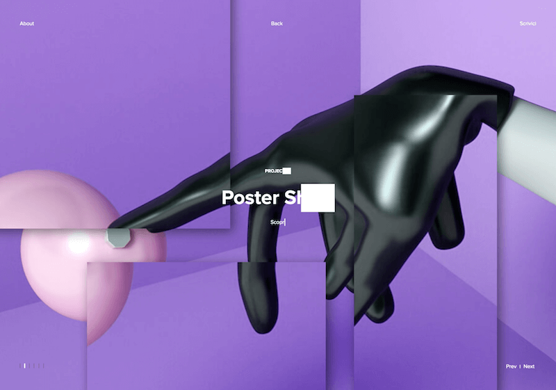
The first project in Filippo Bello’s portfolio uses a purple color scheme that adds to the sense of creativity. (2010)
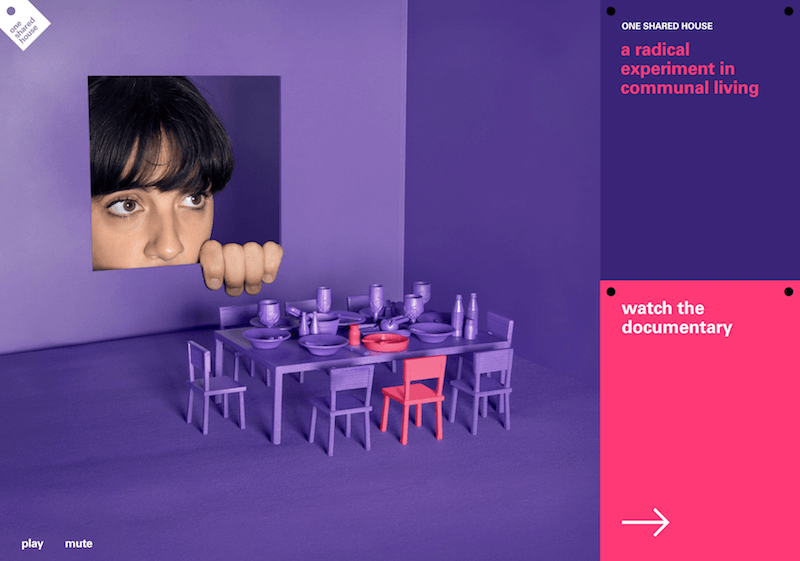
The site for the One Shared House documentary uses a vibrant shade of purple and hot pink accents to give a sense of energy, creativity, and imagination.

On Content Stack, reddish purple works great as an accent color against a neutral background, and draws attention to important page elements, like buttons.
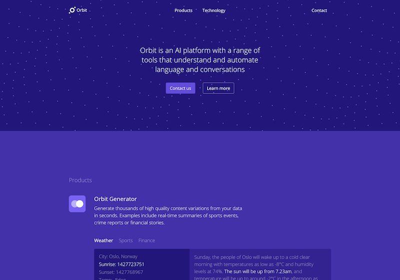
The dark purple hues of Orbit’s website give a sense of sophistication fitting their AI.
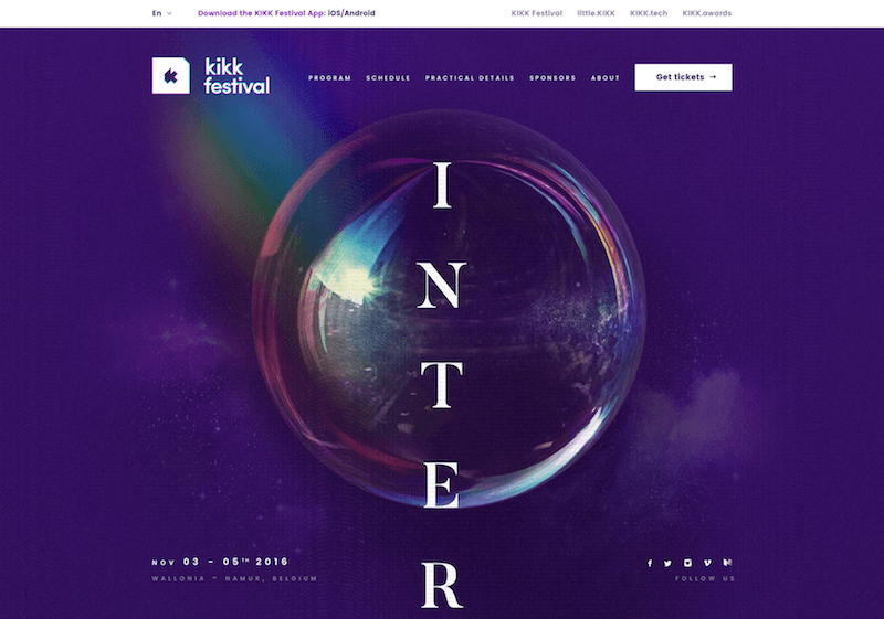
Purple is the perfect hue for a creative endeavor like KIKK Festival 2016.
Neutrals #
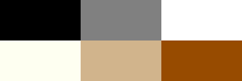
Neutral colors often serve as the backdrop in design. They’re commonly combined with brighter accent colors. But they can also be used on their own in designs, and can create very sophisticated layouts. The meanings and impressions of neutral colors are much more affected by the colors that surround them than are warm and cool colors.
Black #

Black is the strongest of the neutral colors. On the positive side, it’s commonly associated with power, elegance, and formality. On the negative side, it can be associated with evil, death, and mystery. Black is the traditional color of mourning in many Western countries. It’s also associated with rebellion in some cultures, and is associated with Halloween and the occult.
Black, when used as more than an accent or for text, is commonly used in edgier designs, as well as in very elegant designs. It can be either conservative or modern, traditional or unconventional, depending on the colors it’s combined with. In design, black is commonly used for typography and other functional parts, because of its neutrality. Black can make it easier to convey a sense of sophistication and mystery in a design.
Examples #
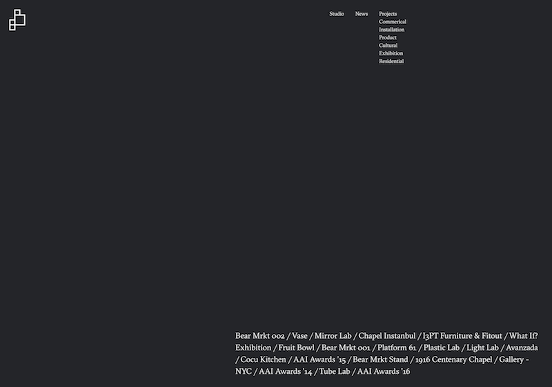
The faded black (technically dark gray, but close enough to black that it makes sense to classify it as such) of the DUA website works beautifully in such a minimalist design. (2010)
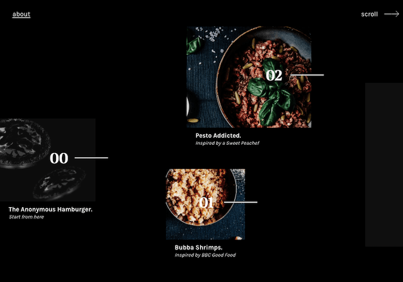
Anonymous Hamburger Society’s black background is a perfect canvas for the amazing food photos on the site. anonymoushamburger
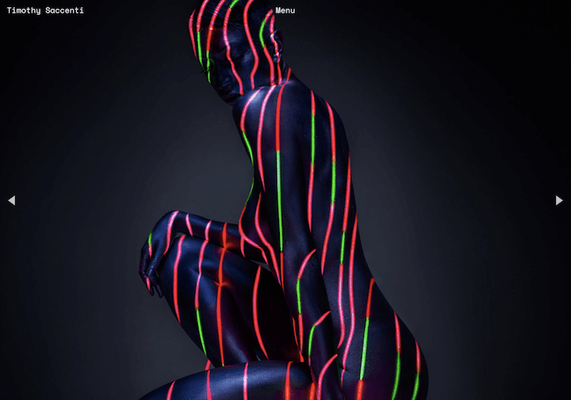
Many of the images on Timothy Saccenti’s portfolio are dominated by black, which is also the color of the transparent menu, giving the entire site an edgy, modern feel. (2010)
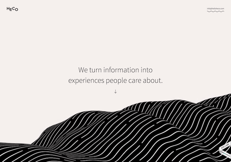
Minimal design with black used as an accent color gives Heco’s site a super modern feeling.
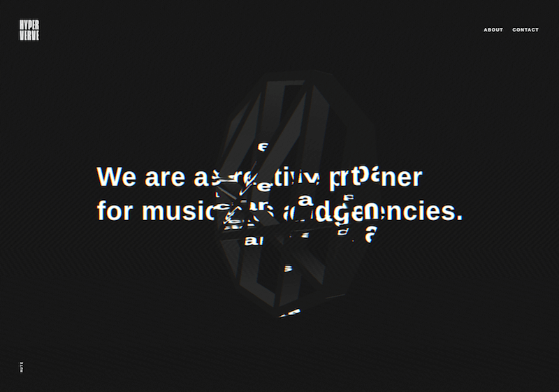
The black hue used here along with the animation gives it an edgy, almost creepy feel.
White #

White is at the opposite end of the spectrum from black, but like black, it can work well with just about any other color. White is often associated with purity, cleanliness, and virtue. In the West, white is commonly worn by brides on their wedding day. It’s also associated with the healthcare industry, especially with doctors, nurses and dentists. White is associated with goodness, and angels are often depicted in white.
In much of the East, however, white is associated with death and mourning. In India, it is traditionally the only color widows are allowed to wear.
In design, white is generally considered a neutral backdrop that lets other colors in a design have a larger voice. It can help to convey cleanliness and simplicity, though, and is popular in minimalist designs. White in designs can also portray either winter or summer, depending on the other design motifs and colors that surround it.
Examples #
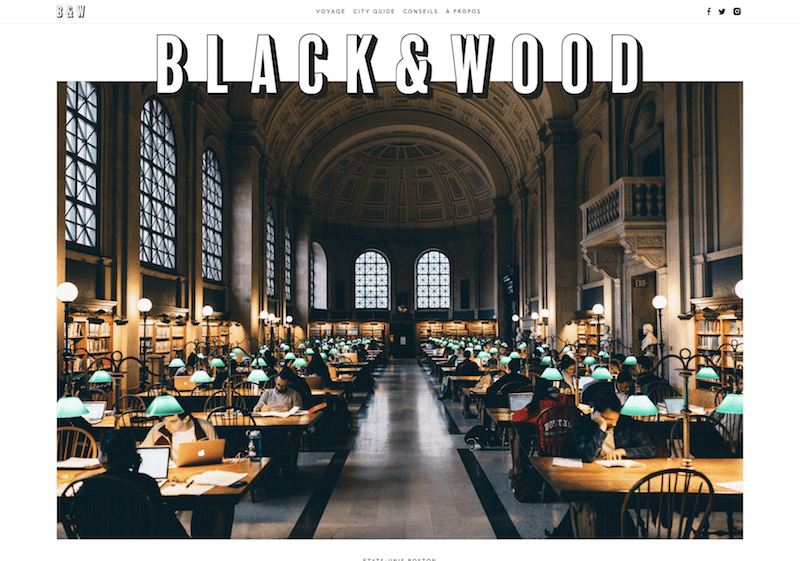
Black & Wood uses white as both a background and an accent color (in their typography, for example), giving the site a very clean feel. (2010)
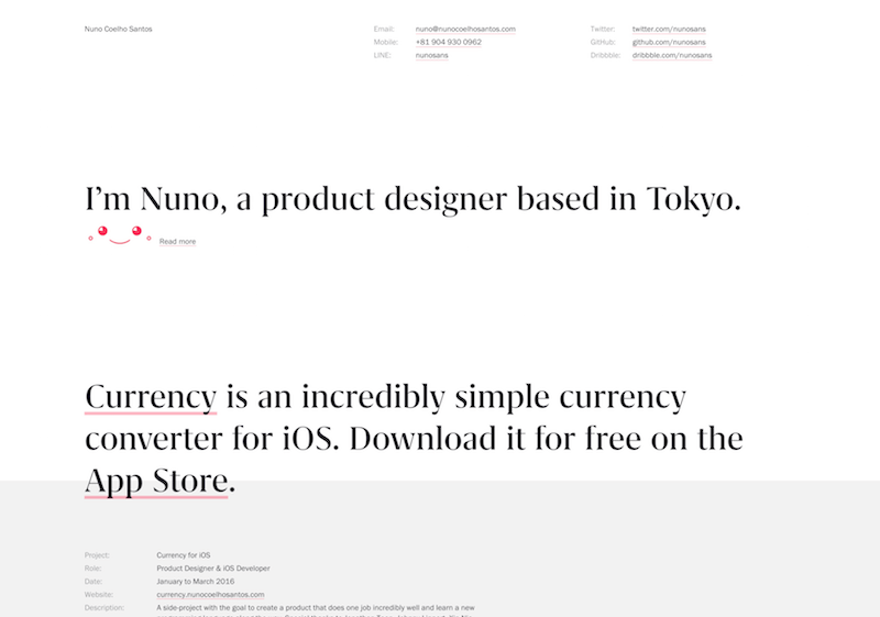
The mostly white background of Nuno Coelho Santos’s website contributes to the modern aesthetic.
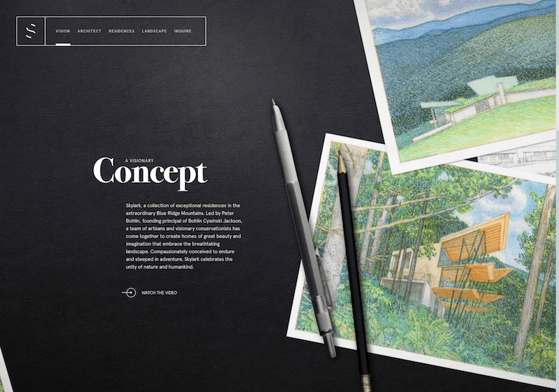
Skylark’s website used white typography to lend the site a cleaner feeling without going minimalist in the design itself. (2010)
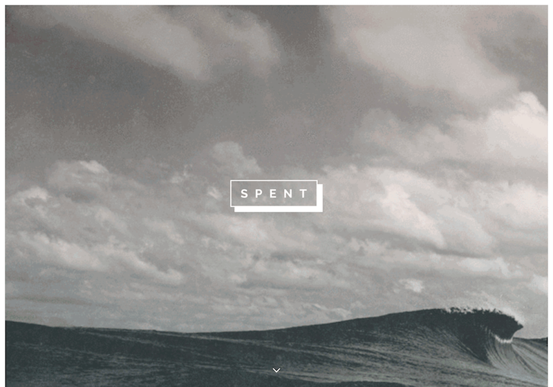
Spent used white typography to lend a modern yet soft look to the site. (2010)
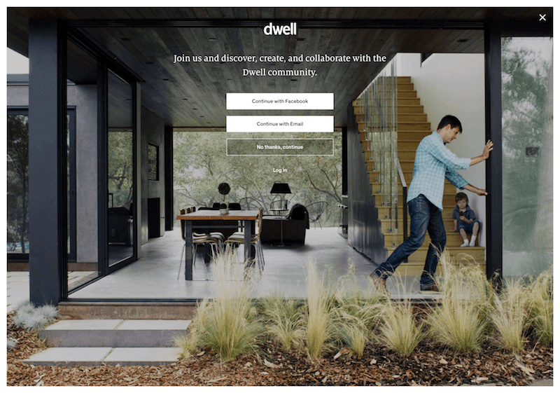
Dwell uses white as an accent color on their splash page, a very unique but effective choice for something that includes a CTA. (2010)
Gray #

Gray is a neutral color, generally considered on the cool end of the color spectrum. It can sometimes be considered moody or depressing. Light grays can be used in place of white in some designs, and dark grays can be used in place of black.
Gray is generally conservative and formal, but can also be modern. It is sometimes considered a color of mourning. It’s commonly used in corporate designs, where formality and professionalism are key. It can be a very sophisticated color. Pure grays are shades of black, though other grays may have blue or brown hues mixed in. In design, gray backgrounds are very common, as is gray typography.
Examples #
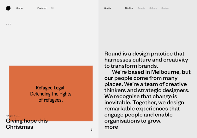
The Round website is very modern, with various shades of gray used to delineate different sections of the site. (2010)
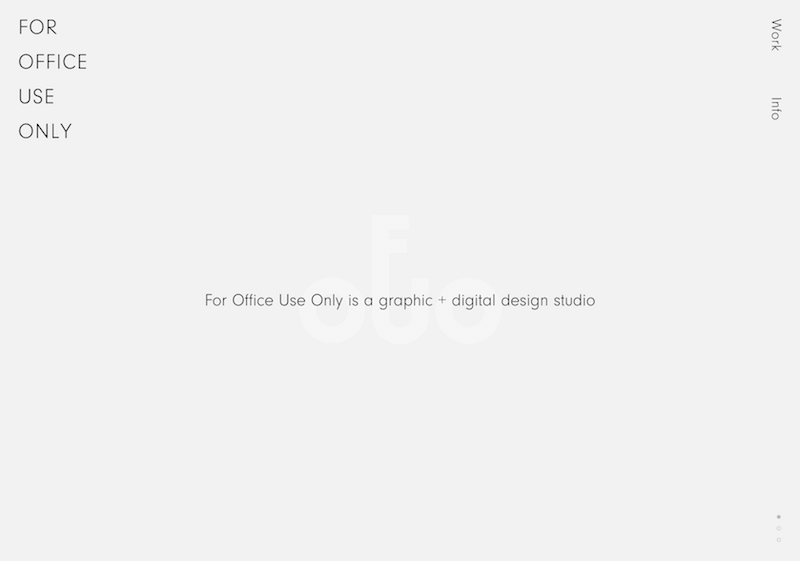
The gray background on the For Office Use Only website is so subtle it almost appears white, and gives the site a very modern feel. (2010)
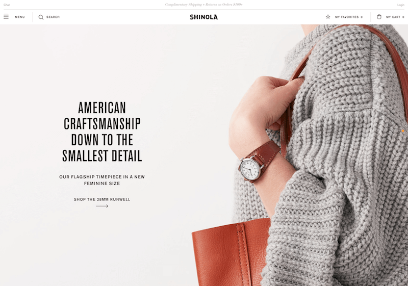
Gray takes on a sophisticated yet down-to-earth feeling on the Shinola website. (2010)
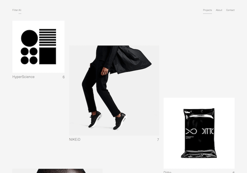
When mixed with modern typography, gray takes on a modern feel. (2010)
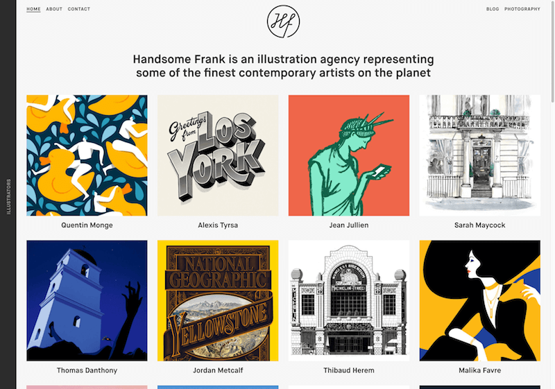
Gray is a perfect background color for a portfolio of illustrations. (2010)
Brown #

Brown is associated with the earth, wood, and stone. It’s a completely natural color and a warm neutral. Brown can be associated with dependability and reliability, with steadfastness, and with earthiness. It can also be considered dull.
In design, brown is commonly used as a background color. It’s also seen in wood textures and sometimes in stone textures. It helps bring a feeling of warmth and wholesomeness to designs. It’s sometimes used in its darkest forms as a replacement for black, either in backgrounds or typography.
Examples #
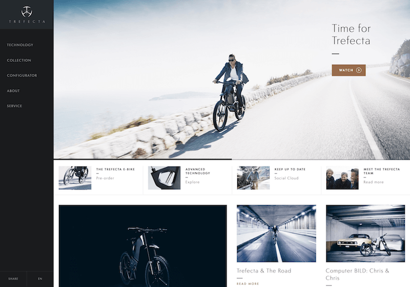
Trefecta uses warm brown as an accent color for buttons and CTAs, an unexpected choice given the modernity of the rest of the design. (2010)
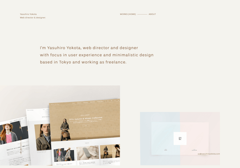
The cream background and brown typography of Yasuhiro Yokota’s portfolio site is warm and earthy, while still serving as just a good a backdrop for design work as shades of gray.
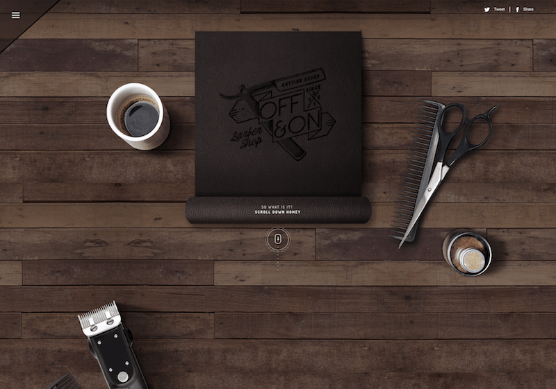
Off & On Barber Shop uses various brown elements for the bulk of their site, giving it an old–fashioned feeling. (2010)
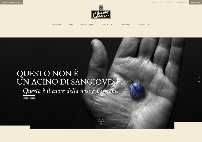
Umbert Cessari’s website uses various shades of brown for accent colors throughout, giving it an earthy appeal. (2010)
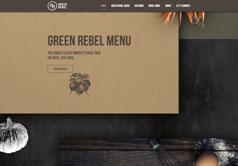
Green Rebel’s website uses brown for much of their typography and graphics throughout, as well as in some of the textures, lending an organic feel. (2010)
Beige and Tan #

Beige is somewhat unique in the color spectrum, as it can take on cool or warm tones depending on the colors surrounding it. It has the warmth of brown and the coolness of white, and, like brown, is sometimes seen as dull. It’s a conservative color in most instances, and is usually reserved for backgrounds. It can also symbolize piety.
Beige in design is generally used in backgrounds, and is commonly seen in backgrounds with a paper texture. It will take on the characteristics of colors around it, meaning it has little effect in itself on the final impression a design gives when used with other colors.
Examples #
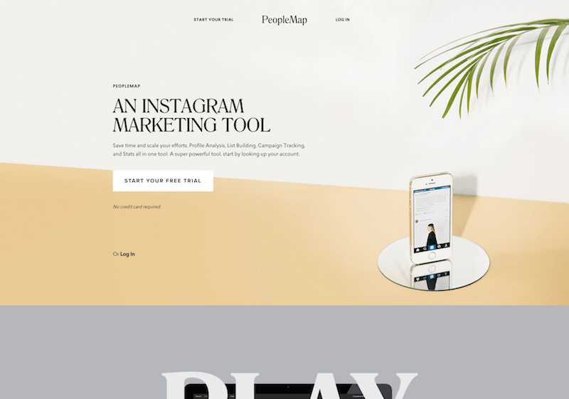
People Map’s website uses a more gold shade of tan, giving the site an upscale feel, especially when combined with the site’s typography.
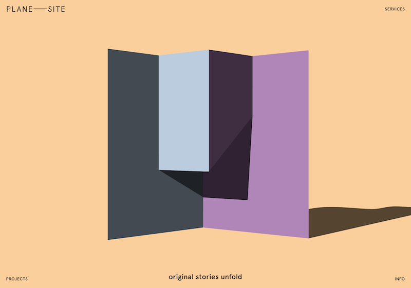
Plane Site’s warm tan background color feels modern without feeling minimalist. (2010)
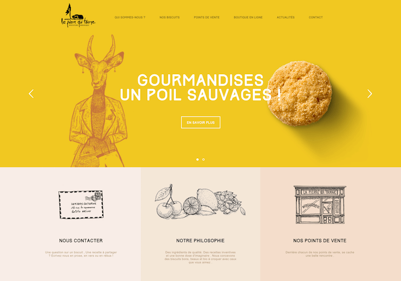
La Pierre Qui Tourne’s website uses a variety of shades of tan for their primary color palette, alongside some great brights for a very fun feeling design.
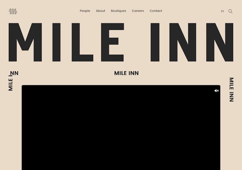
The Mile Inn site combines modern typography with a beige and black color palette for a site that feels retro and hip. (2010)
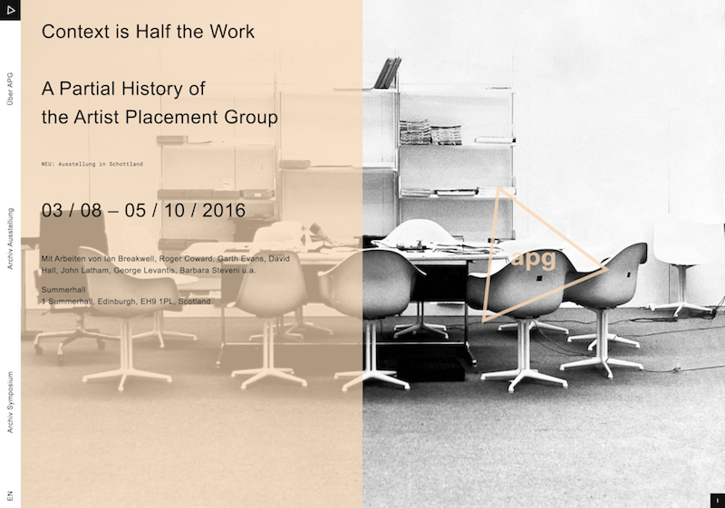
The tan accent color used on this site is entirely unexpected and gives it a Mid–Century Modern look.
Cream and Ivory #

Ivory and cream are sophisticated colors, with some of the warmth of brown and a lot of the coolness of white. They’re generally quiet, and can often evoke a sense of history. Ivory is a calm color, with some of the pureness associated with white, though it’s a bit warmer.
In design, ivory can lend a sense of elegance and calm to a site. When combined with earthy colors like peach or brown, it can take on an earthy quality. It can also be used to lighten darker colors, without the stark contrast of using white.
Examples #
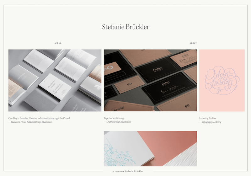
The barely–there ivory background of Stefanie Bruckler’s portfolio site is a welcome change of pace from the typical neutral gray, giving it a timeless look. (2010)
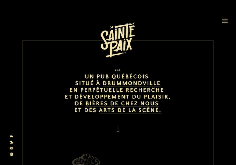
Rich cream feels like a very modern and even edgy accent color when used with a black background.
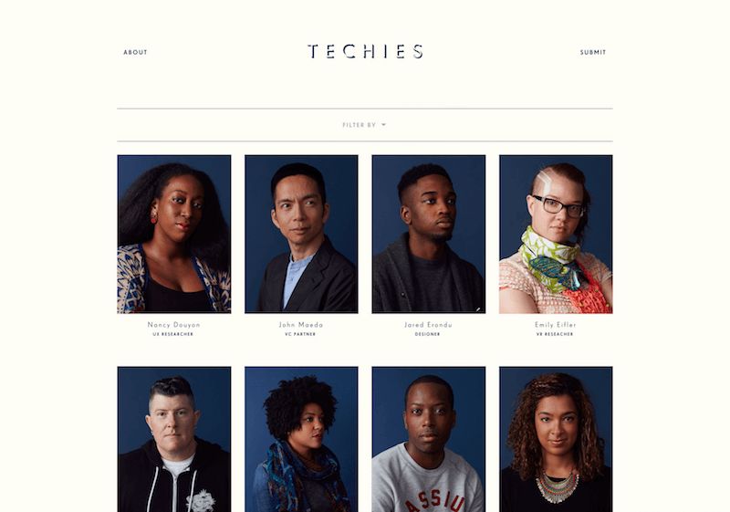
Cream is an unexpected background color choice for a website focusing on those in the tech industry, but gives it a warm, human touch.
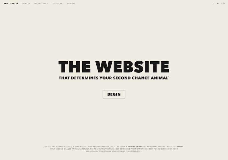
Considering how odd the film The Lobster is, their use of a pale off–white background for the website is an unexpectedly subdued choice that feels very modern. (2010)
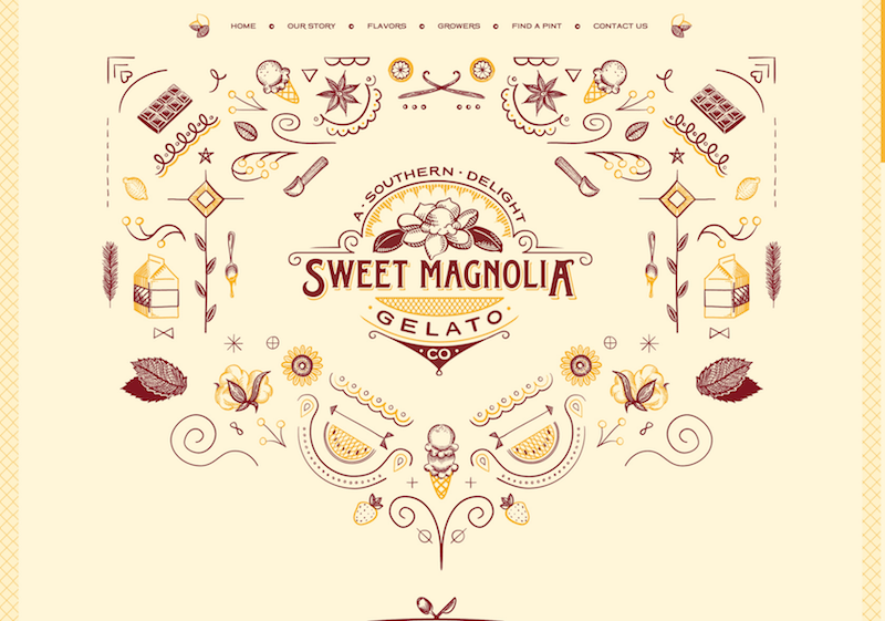
Sweet Magnolia Gelato’s rich cream background is a perfect neutral for a warm and inviting design.
In Brief #
While the information contained here might seem just a bit overwhelming, color theory is as much about the feeling a particular shade evokes than anything else. But here’s a quick reference guide for the common meanings of the colors discussed above:
Red: Passion, Love, Anger
Orange: Energy, Happiness, Vitality
Yellow: Happiness, Hope, Deceit
Green: New Beginnings, Abundance, Nature
Blue: Calm, Responsible, Sadness
Purple: Creativity, Royalty, Wealth
Black: Mystery, Elegance, Evil
Gray: Moody, Conservative, Formality
White: Purity, Cleanliness, Virtue
Brown: Nature, Wholesomeness, Dependability
Tan or Beige: Conservative, Piety, Dull
Cream or Ivory: Calm, Elegant, Purity